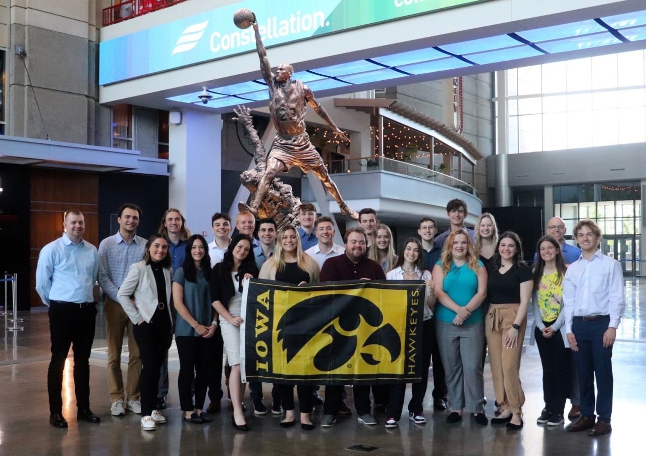
I had the opportunity to take part in a sports marketing and business practicum through The University of Iowa Sport and Recreation Management Program. Taking on the role as a lead designer, the course entailed collaborating with 22 other students on an array of projects presented by the Chicago Blackhawks and Cedar Rapids Kernels.
With objectives pertaining to different aspects of sports marketing and unique goals for each organization, we were tasked with pursuing research and presenting detailed deliverables that align with their brand.
CHICAGO BLACKHAWKS ⦿ CHICAGO BLACKHAWKS ⦿
CHICAGO BLACKHAWKS ⦿ CHICAGO BLACKHAWKS ⦿

Theme Night Jersey
Wanting to retain brand integrity while still paying homage to Chicago, I based the theme night jerseys off the traditional home jersey design with subtle tweaks representing Chicago.
With the Chicago flag in red and black on the elbows and the Chicago skyline in place of a black stripe wrapping around the waist, I believe it clearly embodied the theme while remaining true to the Blackhawks brand.
Moodboard
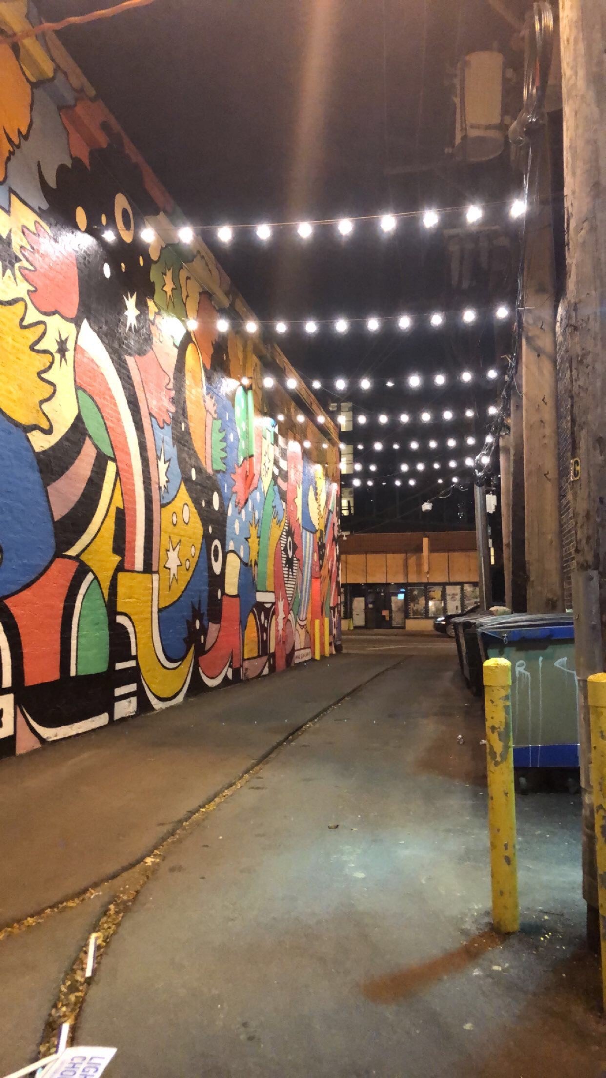
When first beginnining to brainstorm, I knew I wanted to incorporate the industrial qualities of urban architecture and design that Chicago displays. The atrium’s walls could be transformed by brick, steel, and garage-esque wallpapers while indoor lampposts illuminate the area. Hiring local artists to live-paint along with integrating various artists’ work throughout the atrium for sale would be a win-win for everyone as well.
Additionally, I knew I wanted to stay clear of any generic downtown Chicago decor for this atrium activation should be giving life to the neighborhoods and their unique qualities.
Goal #1
To remain recognizable and authentic to the teams’ core values while representing a newly evolved franchise
Rather than rely on the classic red, black, and white combo, each color from the newly expanded color palette is integrated in the event logo design
Recognizable elements of the classic, primary Blackhawks logo is integrated as well
Goal #2
To create an immersive experience into 8-10 Chicago neighborhoods and represent their unique history, culture, and people
Treated the atrium layout like map of Chicago
Focus is on local artists and street art
Street signs differentiating neighborhoods and sections of atrium laced throughout
CEDAR RAPIDS KERNELS ❖ CEDAR RAPIDS KERNELS ❖
CEDAR RAPIDS KERNELS ❖ CEDAR RAPIDS KERNELS ❖
UI/UX DESIGN
After pursuing research, my team and I decided to recommend developing an app.
Using Adobe Illustrator to design the elements and Figma to create a functional high-fidelity prototype, I wanted the app to be forthright, comprehensive, and attractive.
MR. SHUCK’S 5K
Flyer
T-shirt Design


