A
Brain
For Your
Buck!
I was tasked with creating and designing an original board game and its packaging. Inspired by Jeopardy, I created
“Mind Moolah”
Mind Moolah is a high-stakes trivia game that not only fills your brain, but also your pockets. With 7 categories to choose from, it really is a Brain For Your Buck.
Creative Brief
A more in-depth overview of Mind Moolah and the scope of the project.
Branding
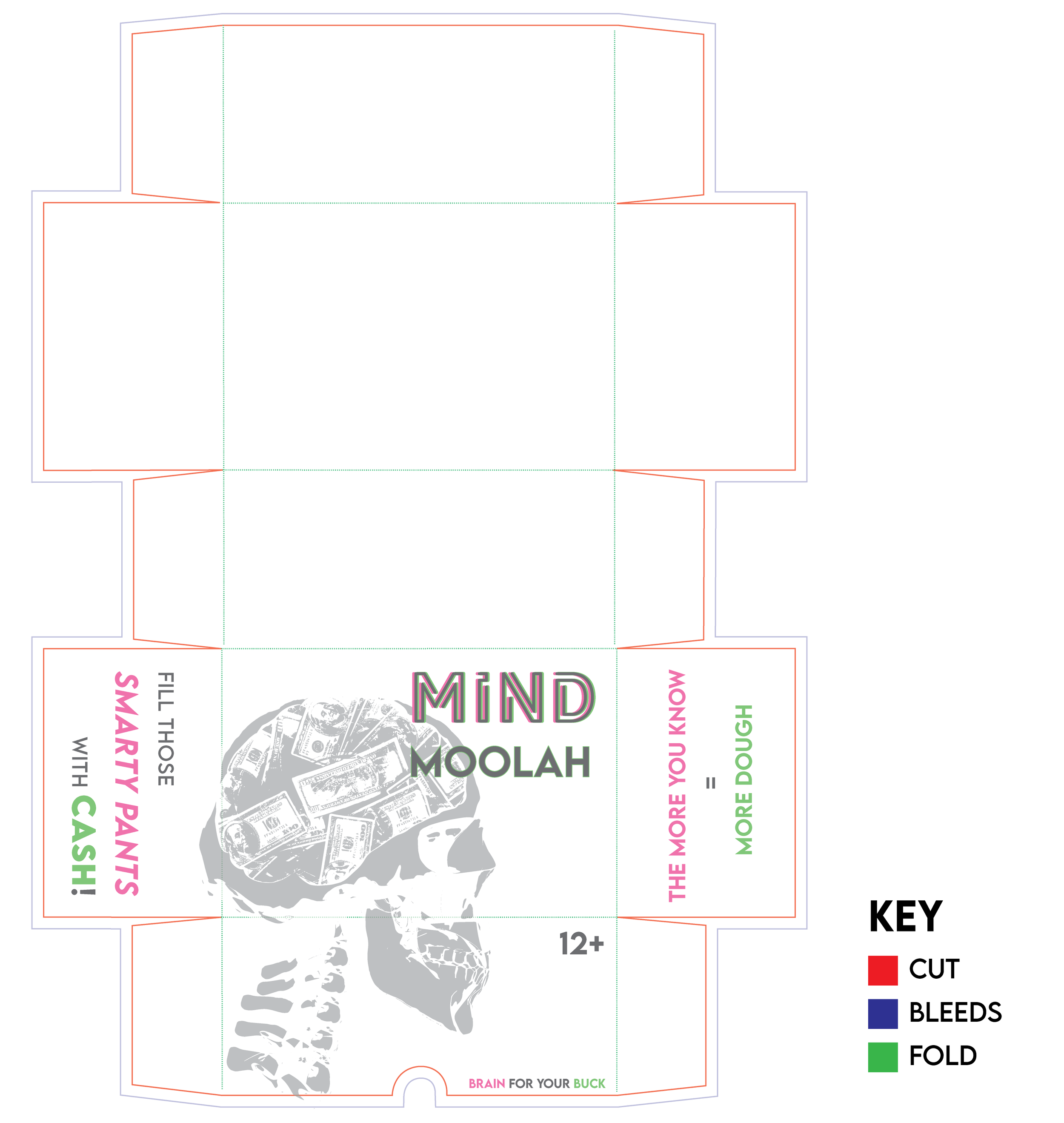
Package Design
Game Design & Production
I really enjoy doing a modernized twist on classic concepts; not only are they fun to do, but I believe they hook younger generations while catering to the older ones as well. I accomplish this not only via design elements, but functionality and production as well.
In this instance, I wanted to pay homage to old-school game-shows while maintaining a polished and sleek appearance—
a balancing act between retro and modern.
Game Design Components
Tile Towers - Trivia Cards - Mind Moolah
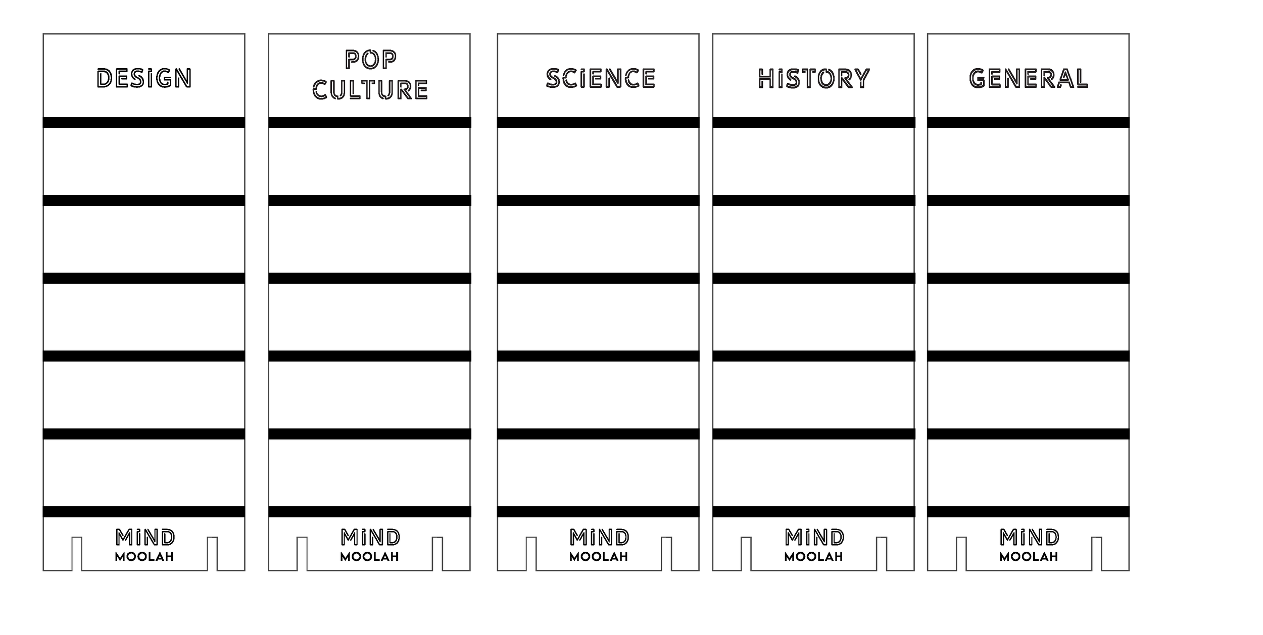
Trivia Cards
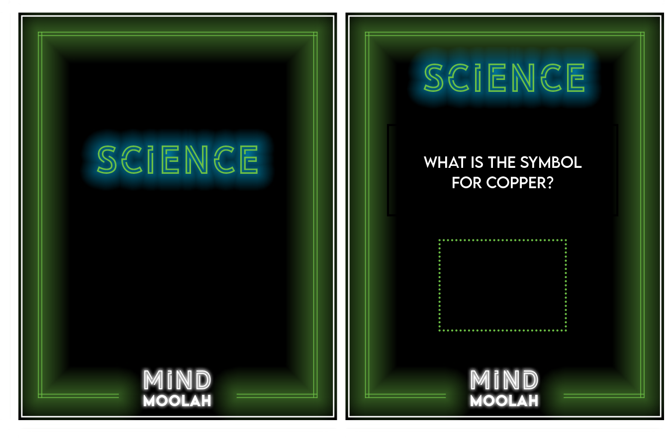
I was inspired by shutter-slide bingo cards when creating the trivia cards. While printing and assembling them was time-consuming, I found this approach to be the most attractive and effective way to conceal and reveal the answers.
Using Excel to organize all of the questions and answers, I merged this data into InDesign to be directly imported into place on the cards. I used Illustrator to design the cards themselves.
Tile Towers/Boards
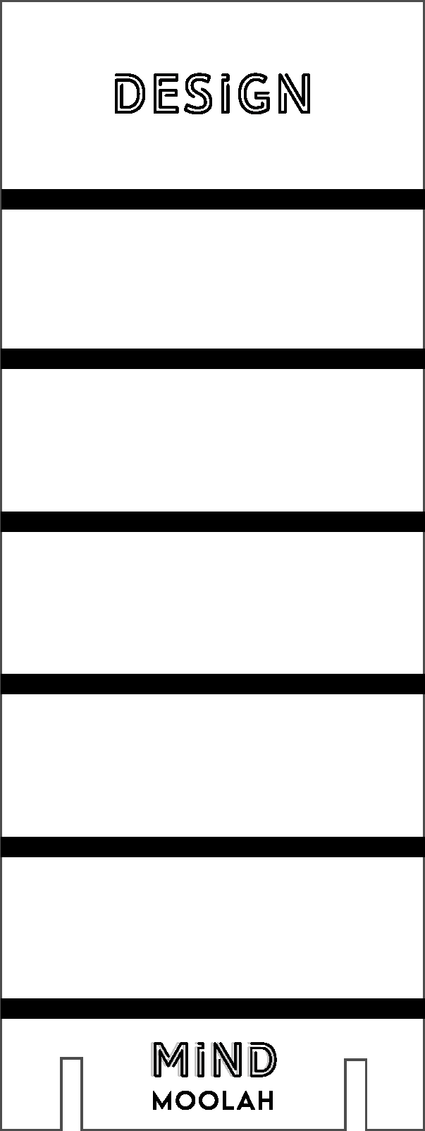
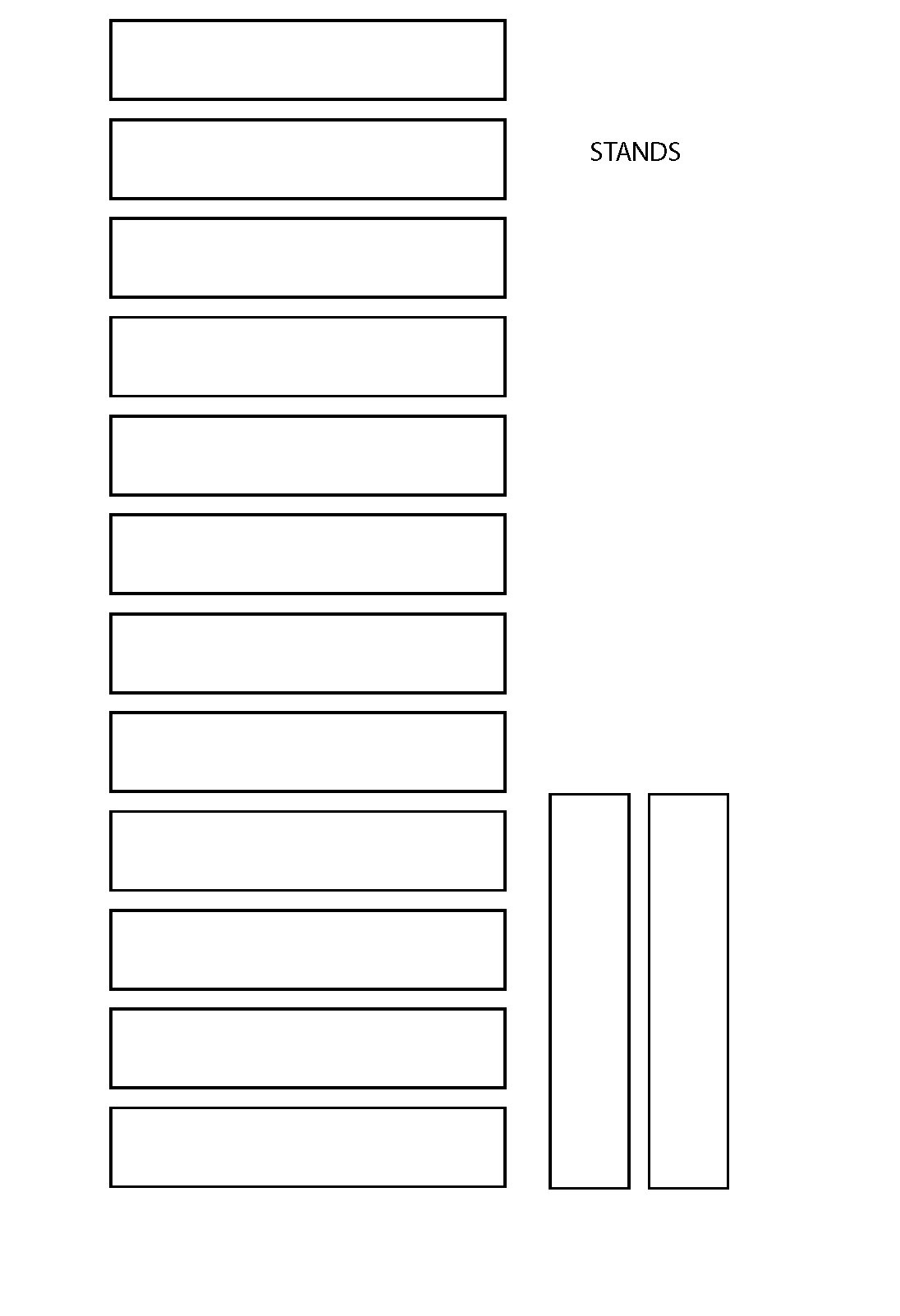
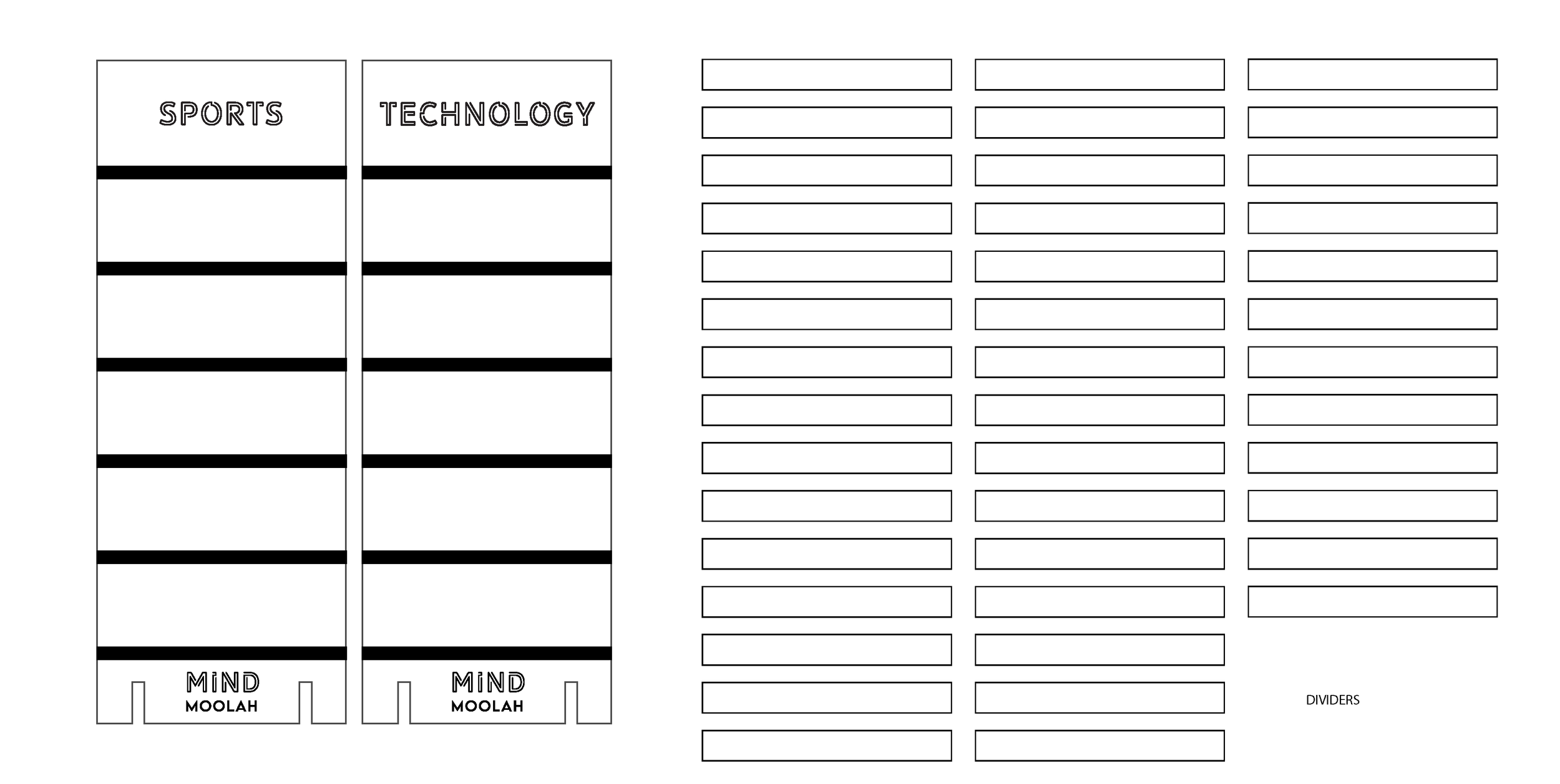
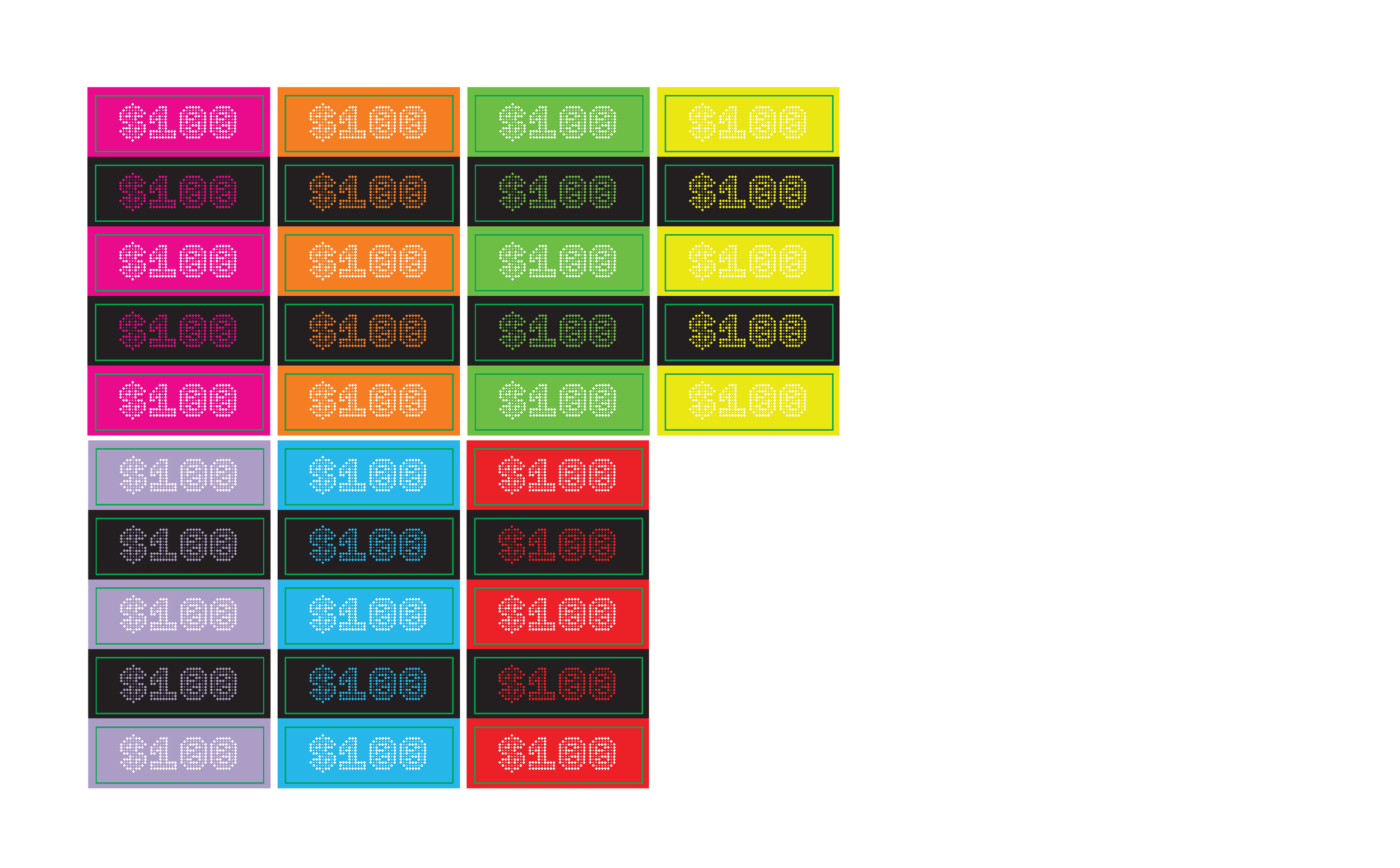
Inspired by Jeopardy, I designed tile towers to represent the trivia categories and the reward per correct question answered.
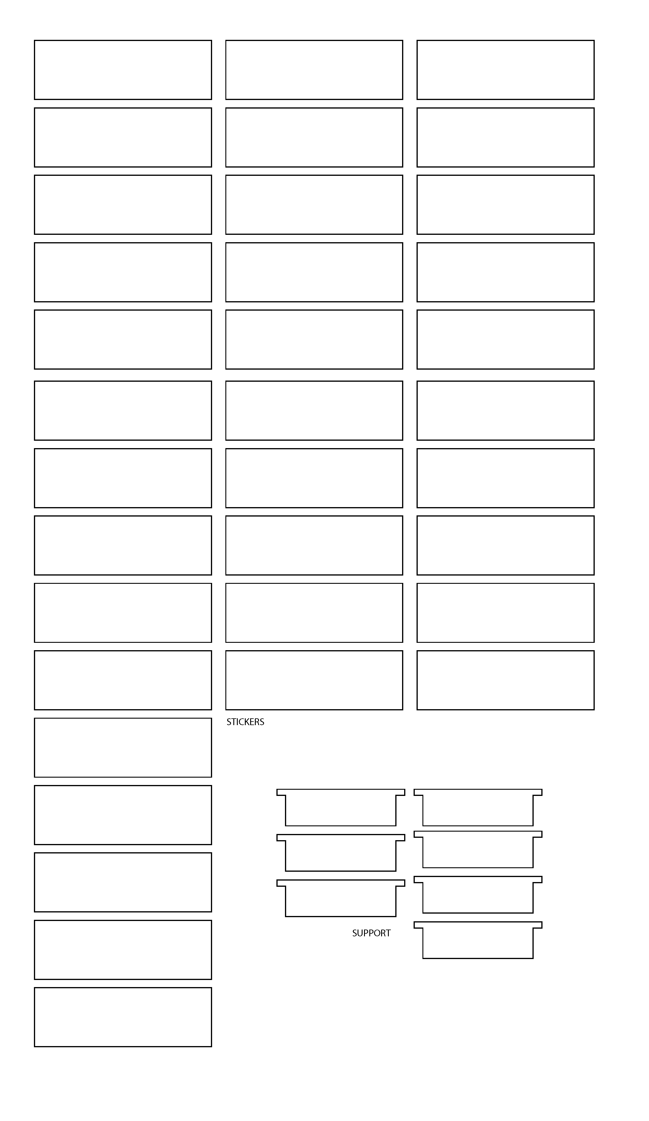
I used Illustrator to design the pieces and all of their structural components as well as the tiles. I then used a Glowforge Laser to precisely extract the towers and tiles out of colored acrylic as well as engrave any typography and graphics.
Mind Moolah
One of my favorite components of the project! I love a play on words and implementing a witty twist on something classic.
Given it represents answering the most questions right and is the key to winning, I included each category’s color in the design to tie the whole game together. I also wanted it to be reminiscent of an actual piece of money and utilized the brand’s pictorial mark in place of a president— paying homage to the name of the game as well the brand.




Package Design
One of my favorite components to include in design is the use of witty typography.
While I find conjuring up clever sayings to be fun and thought-provoking, I believe they serve as great attention grabbers regarding packaging and marketing.
PRIMARY LOGOS
FULL LOGO


WORDMARK


SECONDARY LOGO & BRAND GRAPHIC


Electric pink, Zunda green, and black are the brand’s primary colors while white serves as a complementary, secondary hue. Not only does the neon pink and green highlight two of the colors used to symbolize categories within the game itself, but they contrast sharply against the black creating a striking fluorescent appearance. This in combination with the secondary font, Library 3AM Soft, produces the very retro and playful quality that I was aiming for while being a cohesive element throughout the game.
Primary Font
Secondary Font

○ PROCESS ○
